Type and Image
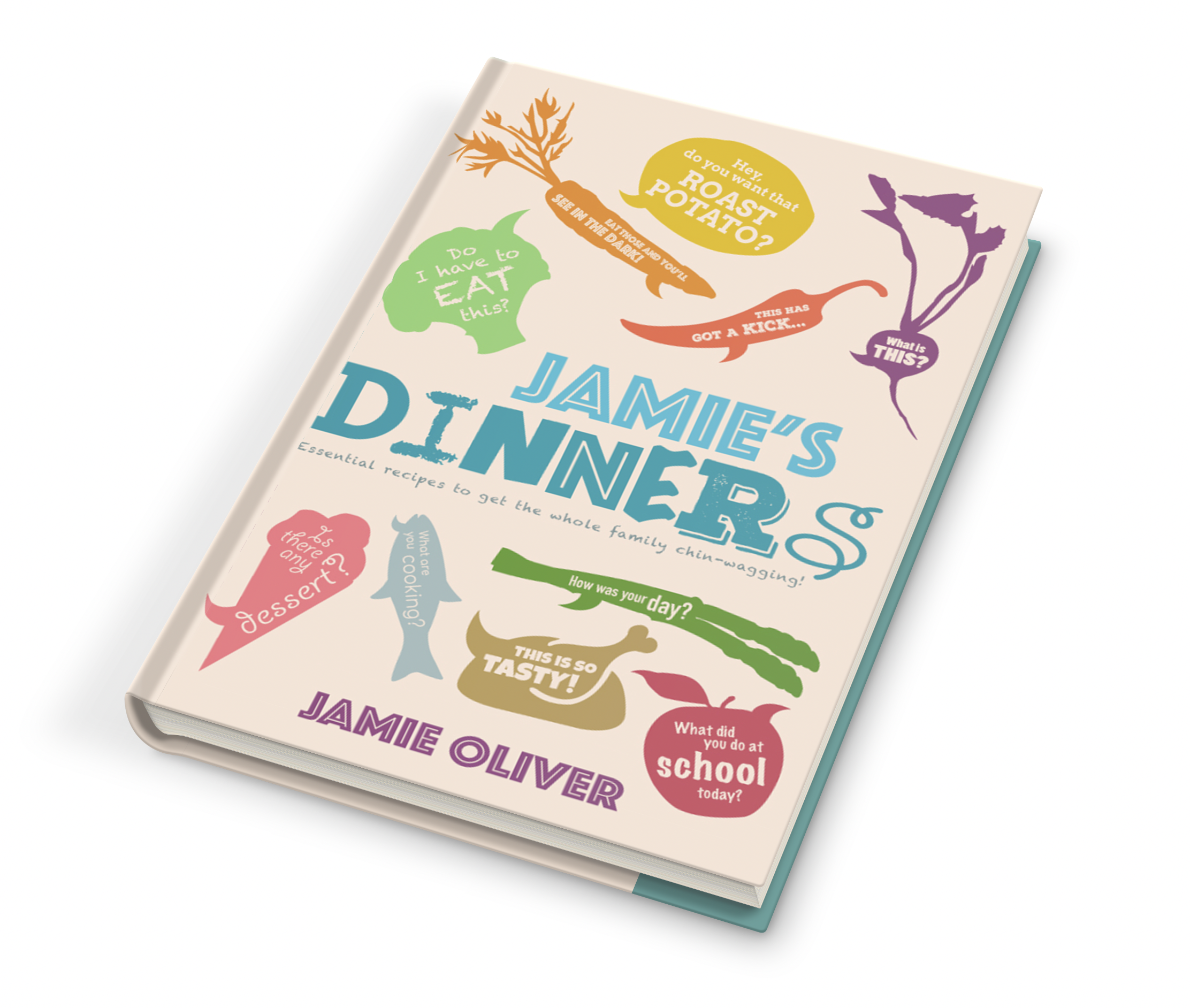
A special edition cook book cover design.
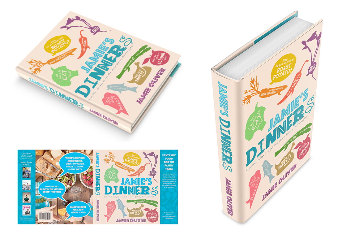
Brief: Using type and image, create a ‘special edition’ cover design for a Jamie Oliver cook book.
I chose the book ‘Jamie’s dinners’. This book is designed to encourage families to eat healthier meals at home. All of the recipes in this book are focused around using healthy and fresh ingredients to cook the meals. This book’s main target audience is families and parents with children where they can cook quick, simple but healthy and ‘wholesome’ meals that the whole family will love. I have chosen this book because it caters for whole families and has a wide range of different recipes that include different types of foods.
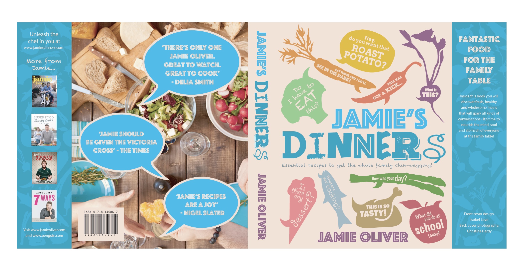
The heading typography represents all of the text in the illustrations on the book cover. Using multiple typefaces for this one word makes it more fun and interesting, and more suitable for the target audience of a whole family.
The typography on the food group speech bubbles visually represents the food and what the words say. I have used different typefaces for each speech bubble illustration because different typefaces relate more to certain foods and to the actual words and text in them. I thought of lots of different phrases that you would say or hear from around the table at dinner time. This also links back to the family element of the book.