Branding and Identity Design
A re-branding project of a newly invented brand and company.
Brief: Using a given company name, develop a distinctive, memorable identity for a new company.
A re-branding project of a newly invented brand and company. The new, made-up brand is a fair trade, high-end bourbon from the mountains of Colorado. The task was to combine this with a new, chosen company. I decided to create a fair trade drink company that produces bourbon.
From this, the task was to create a new brand and logo for this company.
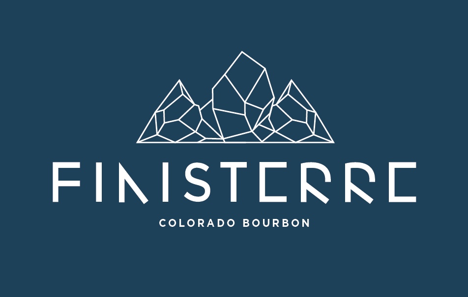
I chose to use the Colorado ‘Rocky Mountains’ as an illustrative part of my logo design to incorporate the location of where the drink is made. I wanted to keep the design minimalistic so I decided to create the illustration using lines only. I also wanted to incorporate the saying ‘On The Rocks’ into the design, which is a way that you can drink bourbon. I have done this by using the mountains as the illustration. This brand is supposed to be high end and expensive, so the diamond shaped mountains show this aspect.
The typography for this logo was drawn in Adobe Illustrator. I created each letter form myself instead of using an already existing typeface. This meant that I could manipulate the letters more to make them look more interesting and different to the average typefaces that you see.
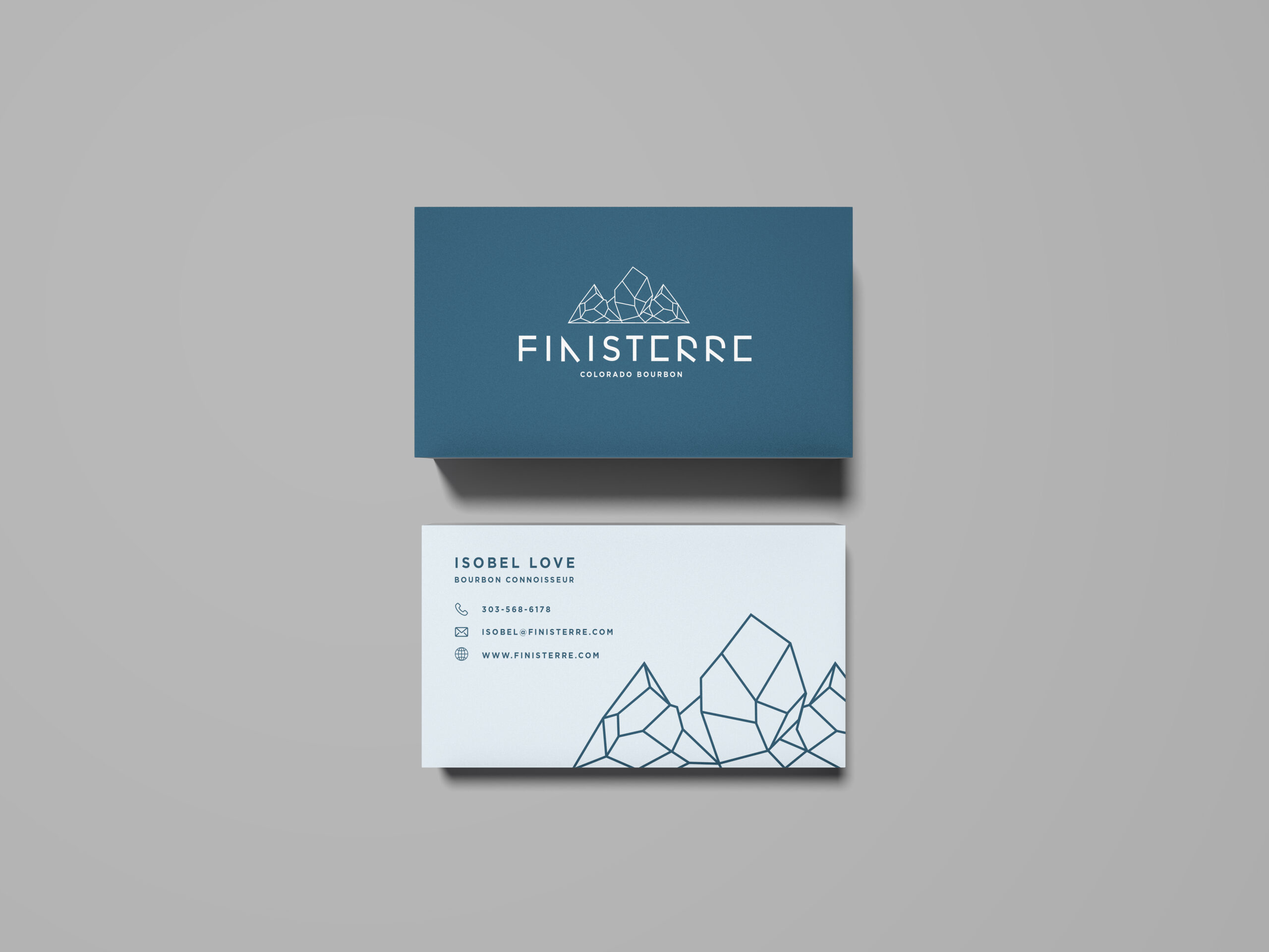
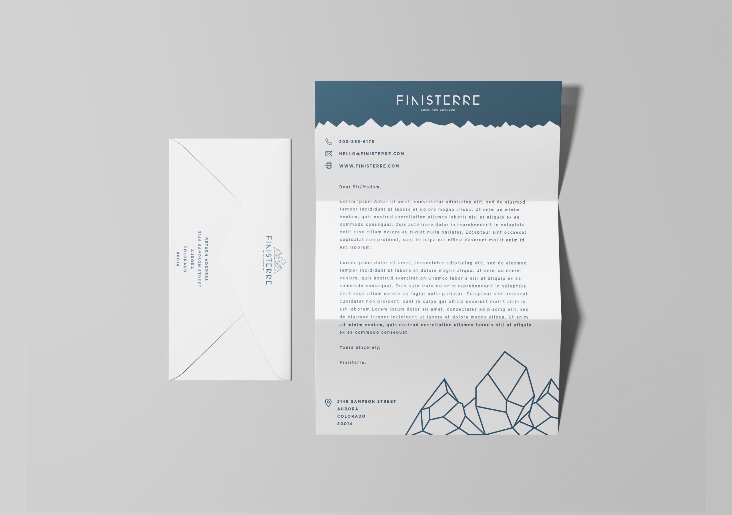
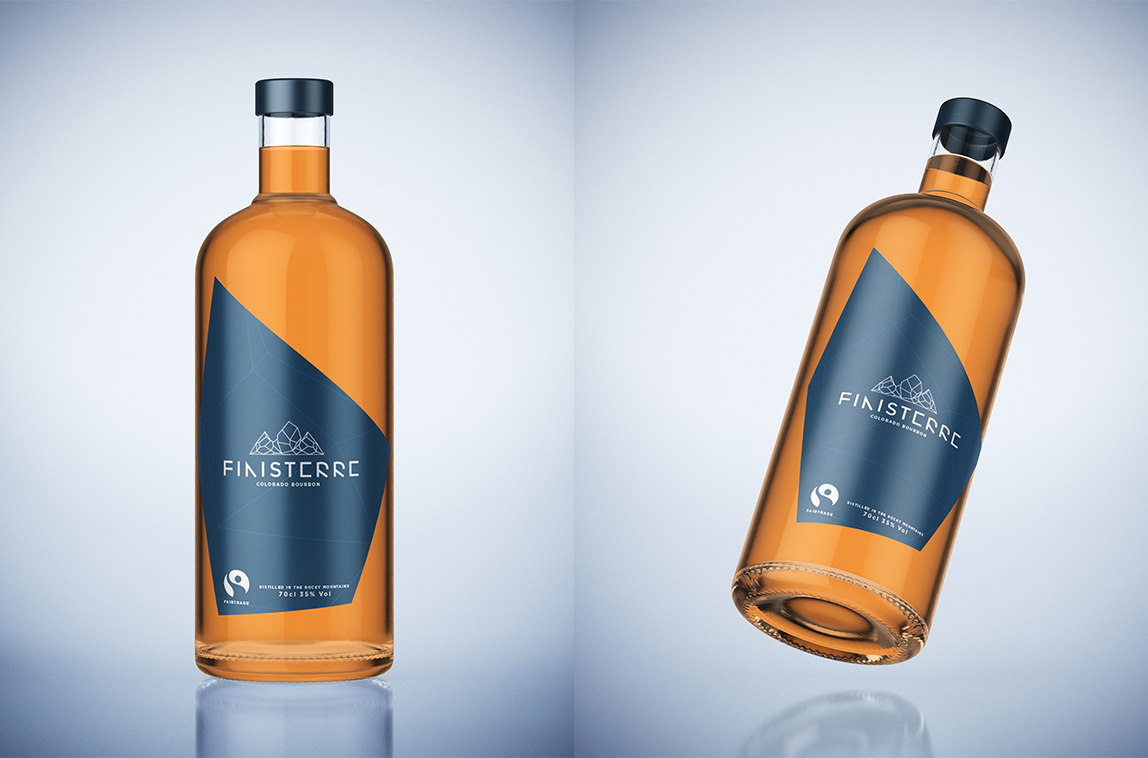
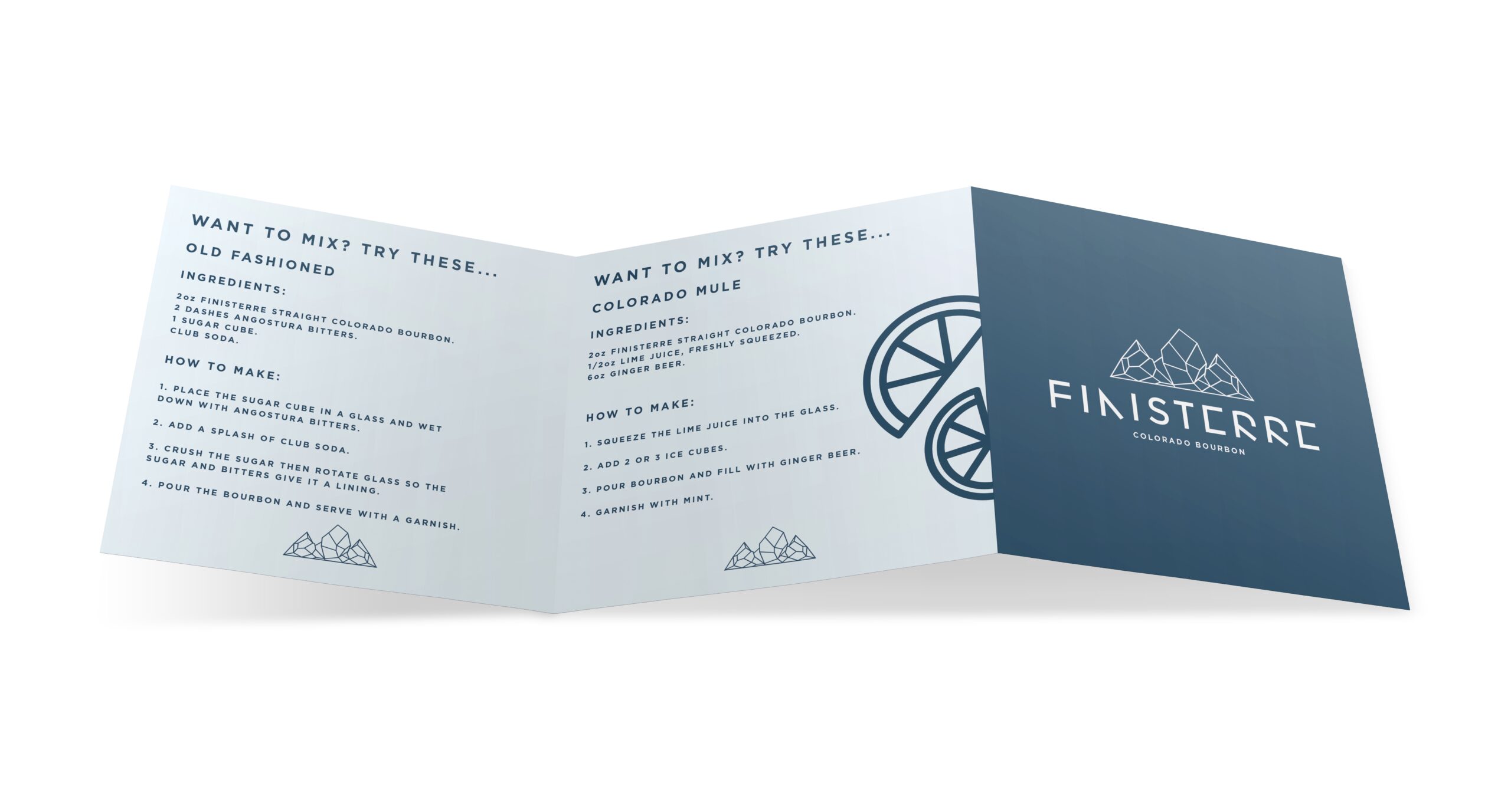
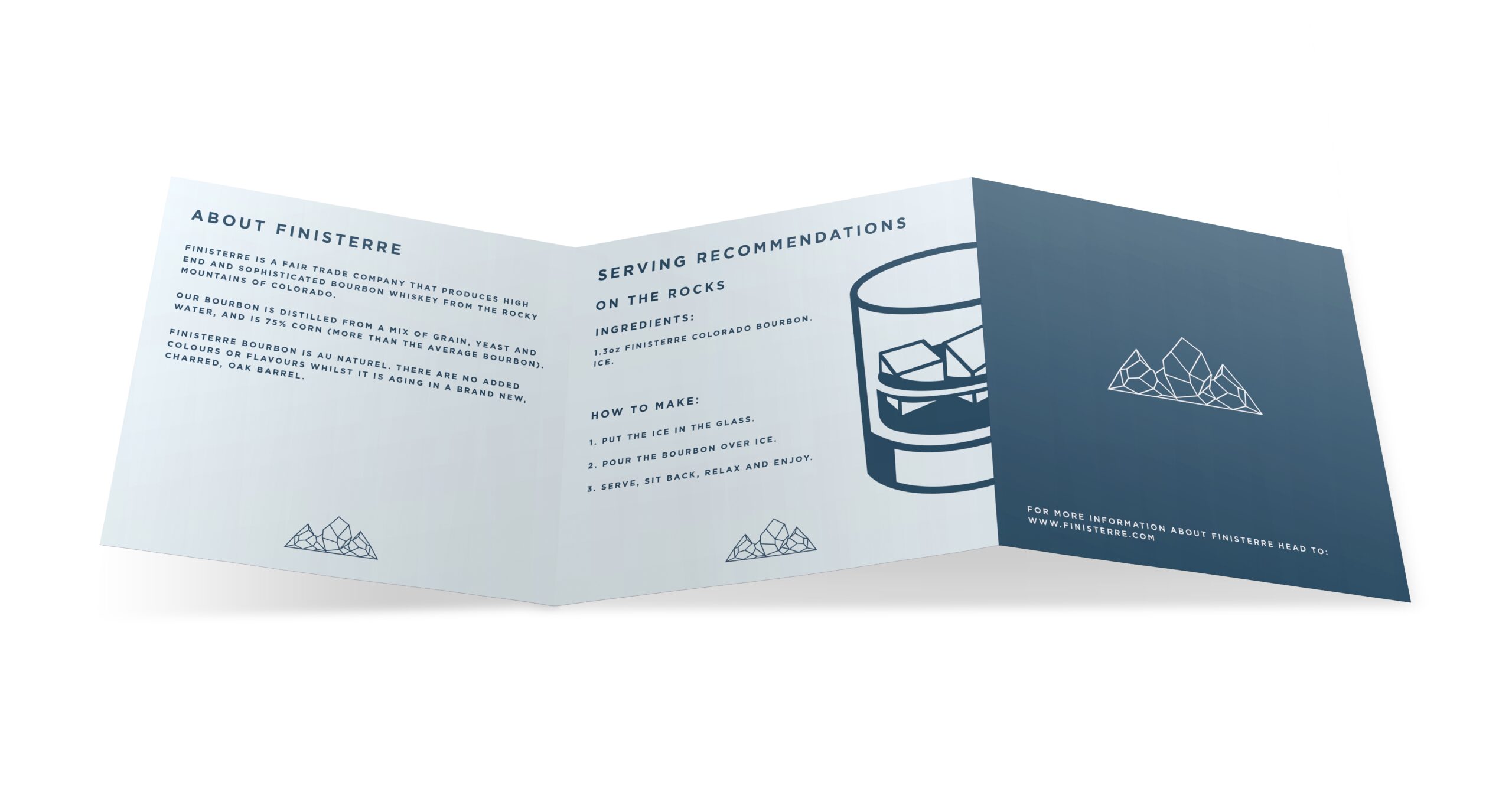
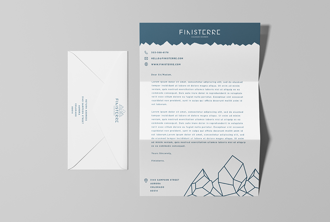
As well as the business cards and letter head, I designed some bourbon bottle labels, box packaging for the bourbon and an extra serving recommendation card. I thought these would be appropriate extras to design, to make the company seem more real. The shape of the label is different to what you would usually see in a store. I wanted it to represent the brand and the logo where I have used similar shapes to create the mountains.
